Miharu's Artist Statement
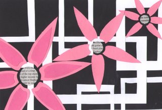
What I was trying to achieve through my piece was space, line, and movement. I think I did a good job on all three.
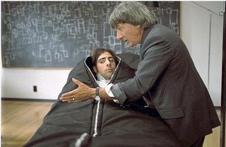
I have always been interested in how appealing rectangles look when they overlap each other in massive amounts. I first saw this in the film, I Heart Huckabees. In the scene, Dustin Hoffman is facing towards the camera, then turns around and you can see all these squares in chalk overlapping one another. A second later, you see that on the chalkboard is the exact same pattern, implying that he had leaned on it.

Last trimester, when I started in illustrator, I got to overlap all the rectangles I wanted. This led to my idea of putting those overlapping rectangles in my little composition. These lines serve to create an interesting background. It sort of leads your eye around the piece.
I chose to use flowers to create space because I just like flowers a lot. I take pictures of them all the time. It’s a sort of natural interest. I wanted the give the impression that these flowers were being looked at on a hill, with the biggest flower being closest to you. I included more detail in the closest flower to reaffirm that idea that the viewer would be able to see closer details on the flower nearest to him. Then your eyes drift into the back of the piece, the smaller flowers.
The movement is created through the pattern of the flowers. Your eyes follow the flowers back. Also, unifying the piece is the newspaper circles, which add another pattern that makes the piece flow.
I wanted my composition to create a peaceful atmosphere. With the soft colors and the white, geometric shapes, I achieved it.
