
My piece came around very nicely. I knew I had a pretty good idea when I started, but I wasn’t sure if it would come together. I was very worried about my skills in Illustrator. I had seen examples in class and I knew that all the best were very detailed. Thankfully it did.
I find the colors to be very attractive and eye popping. I think a lot of the digital imaging these days are leaned towards the very bright, poppy type art. Art that is supposed to grab the eye with color. Because most digital imaging is so exact, I think come to the point of nearly being too perfect. I think that happened when I was working. I tried too hard to capture the exact details of the piece, and stylistically, it didn’t turn out as well. My background didn’t exactly match the details of my body.
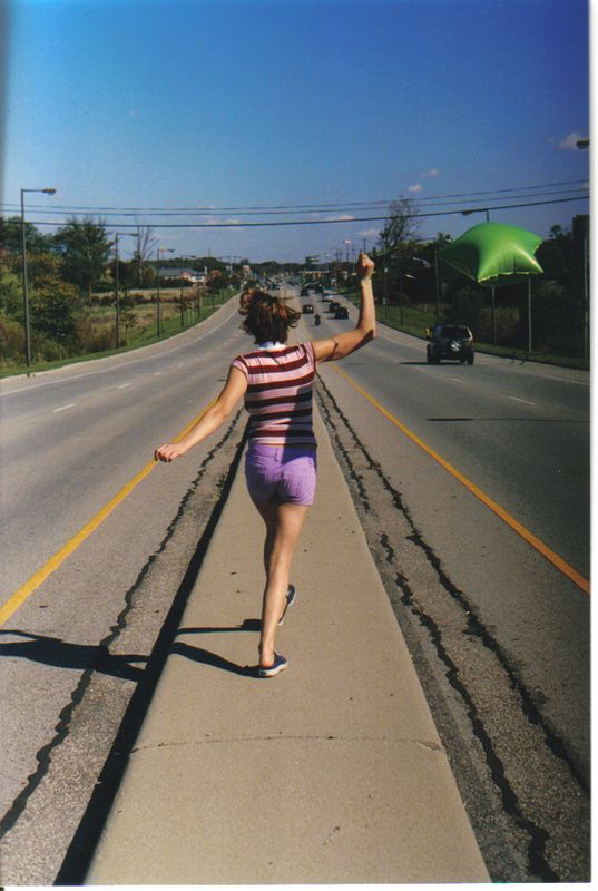
I think I got the idea from some of the pictures I had taken with Sharon. She came up with the idea of her holding the balloons, so it actually wasn't myself that inspired myself. It was Sharon who inspireed me. The rolls I took of her turned out to be one of the best Ive ever taken, so I'm thankful for that idea she had. If she hadn't thought of the balloons, it wouldn't have ended up as well as they did.
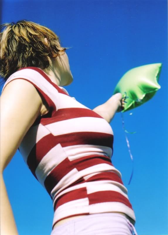
I've always enjoyed clouds, so I think it's my every day life that inspired me to make something with clouds in the background. But I think it may have been this pic that inspired my color pallete. I noticed how well lime green and bright blue go together, and I decided that I really liked how that worked out. So I chose my lime green shirt on purpose.
I find the colors to be very attractive and eye popping. I think a lot of the digital imaging these days are leaned towards the very bright, poppy type art. Art that is supposed to grab the eye with color. Because most digital imaging is so exact, I think come to the point of nearly being too perfect. I think that happened when I was working. I tried too hard to capture the exact details of the piece, and stylistically, it didn’t turn out as well. My background didn’t exactly match the details of my body.
I think I got the idea from some of the pictures I had taken with Sharon. She came up with the idea of her holding the balloons, so it actually wasn't myself that inspired myself. It was Sharon who inspireed me. The rolls I took of her turned out to be one of the best Ive ever taken, so I'm thankful for that idea she had. If she hadn't thought of the balloons, it wouldn't have ended up as well as they did.
I've always enjoyed clouds, so I think it's my every day life that inspired me to make something with clouds in the background. But I think it may have been this pic that inspired my color pallete. I noticed how well lime green and bright blue go together, and I decided that I really liked how that worked out. So I chose my lime green shirt on purpose.