Monday, March 30, 2009


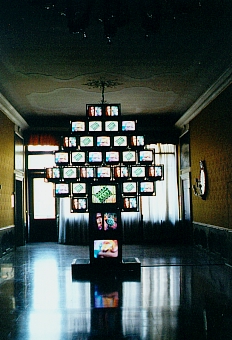
Video Artist: Nam Jun Paik

He's considered to be the first video artist. I did a research project on him last semester so I'm familiar with his work. He made many video installations and created TV robots. He's influential to me because he was a pioneer in the whole area of video art. His way of thinking, to always keep experimenting inspires me to not stand still, to not do what I know.

Video Artist: Bill Viola

He's another pioneer in video art. Bill Viola's work is slow moving but full of beautiful imagery. His '91 piece, The Passing is a big inspiration for my next project. He uses the camera as a tool to sharing his exact perspective. In one scene he has it strapped to his head and I think it's both hilarious and an amazing technique.
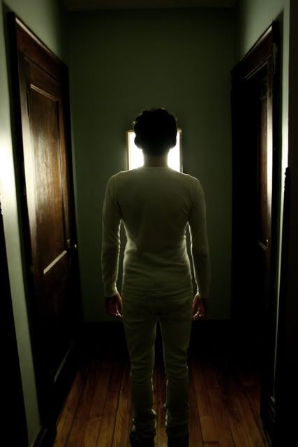
The idea:
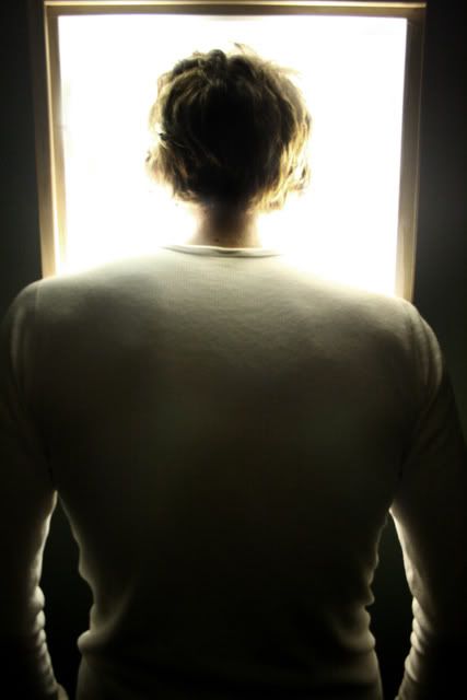
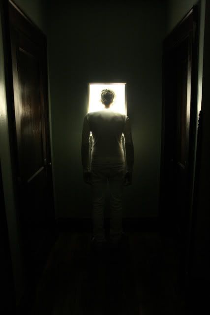
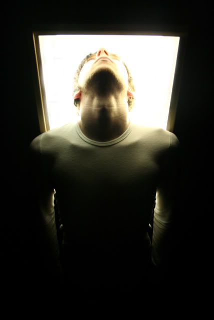
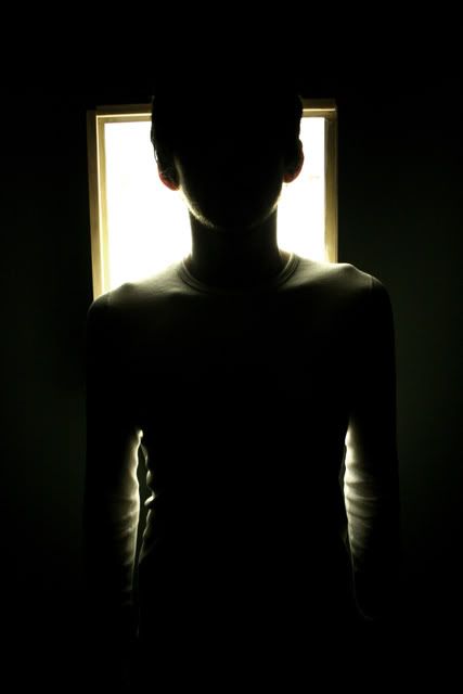
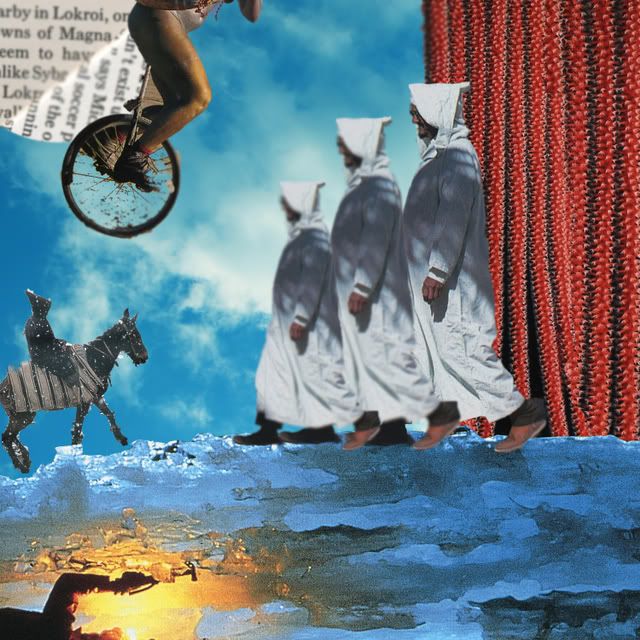
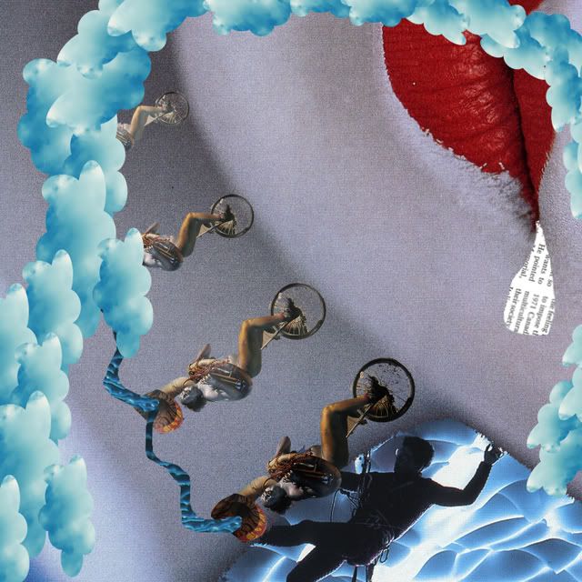
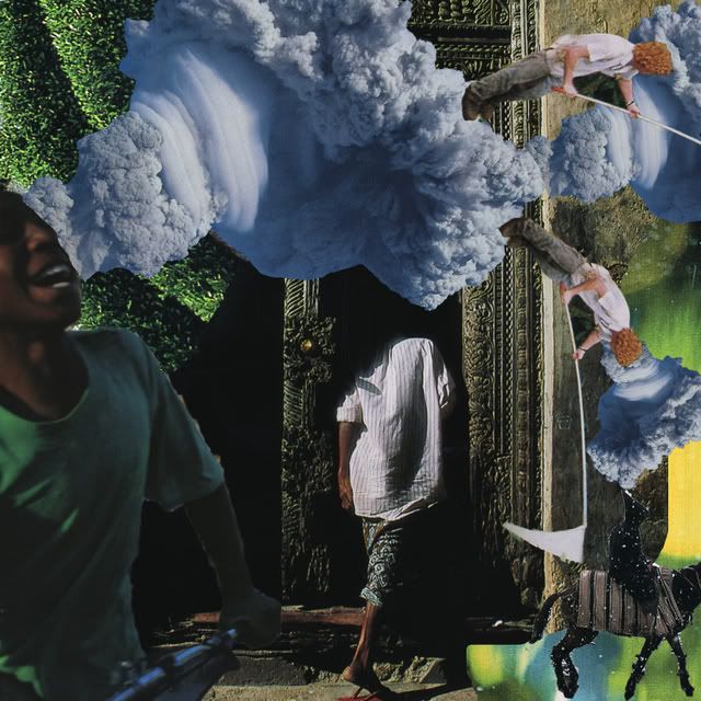
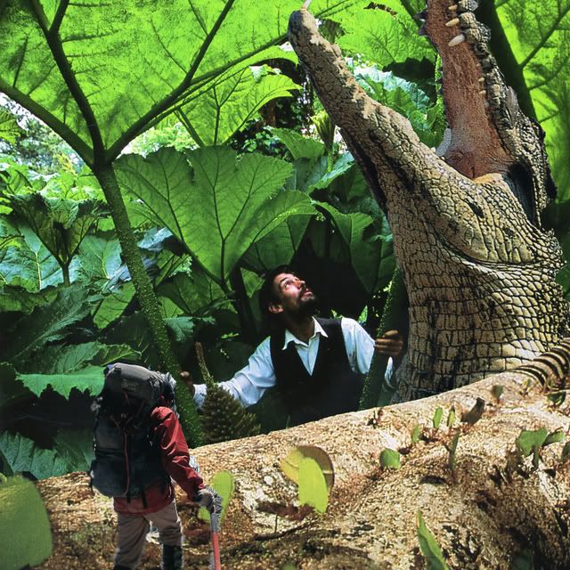
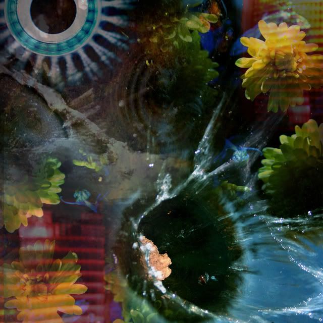
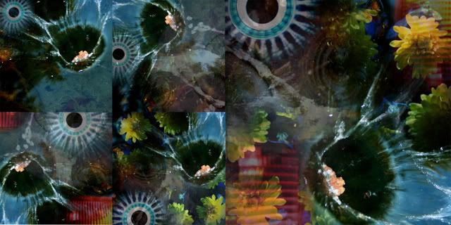
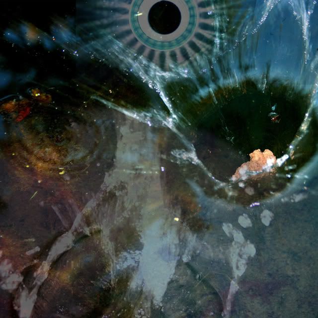
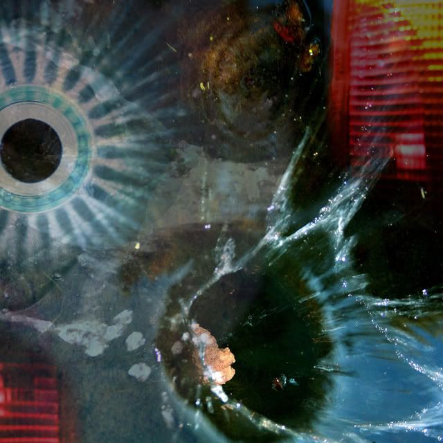
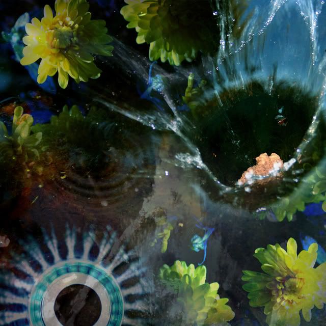
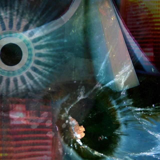
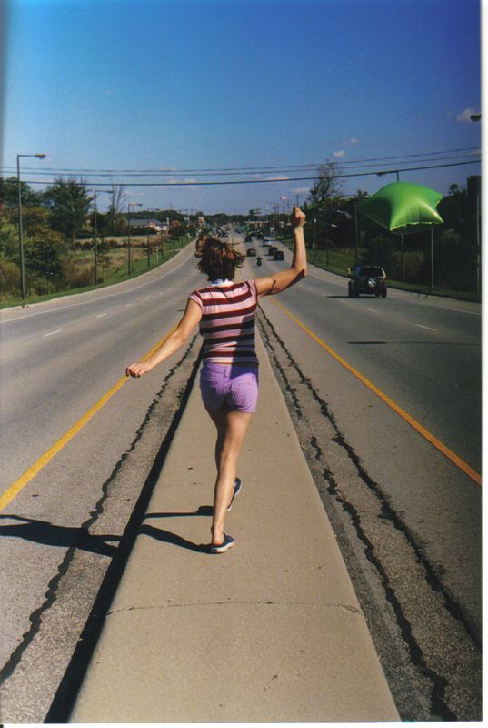
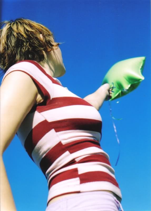
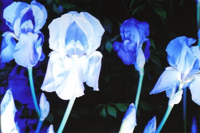
My next piece will be a video of transitions. I want to shoot it all from a first person point of view, but I want the scenes to merge into each other. I want to make it seamless. I want one scene to roll into the next. For instance, in one scene I could be riding my bike into a dark tunnel, and once it goes completely to black another scene will start out in the dark but maybe I'll then be walking in a field at night. I want it to seem loosely based in reality, but more stream of conscious, walking through a dream type of mindset. One of the artists I'm looking at has a very slow style, he's not afraid to make the viewer sit and contemplate what exactly is going on. I'm going to attempt the same thing, but have lots of other fast shots to keep the attention.

Monday, March 16, 2009


Photobucket

Another aspect of photography that has always bored me is the static nature of the photo itself. There are ways around this, such as dragging the shutter to capture movement, but there are only so many times you can see pictures like these before you get bored. With the transitions project, I'd like to break the notion that photos are only stills of life. By putting two images together and flashing them back and forth, it suddenly takes on a 3rd dimension. It adds a different kind of depth you can't see in only one photo. I've always wanted to stay away from the single photo. The marriage of digital technology and photography opens doors for new kinds of experimentation. With this process, I want to give a live action element to the photo. It's a still photo, but it's constantly in flux so it's like a .2 second time frame is repeated over and over. This is another example of how such a brief moment of time can be made into a beautiful capture.

Monday, March 02, 2009

Transitions-

For this project I'd like to create a video using a technique I learned a while ago but never utilized. By offsetting the camera at small increments on the tripod, and playing the pictures back and forth in rapid succession it, (in a gif) it creates the illusion of a 3D space just inside the two pictures. I'd like to create a video putting together multiple images of this technique.

(if you want to see them more clearly, check out my other blog)
http://isawyouinmydream.blogspot.com/

Photobucket


Photobucket

Monday, February 09, 2009


I've always been interested in the unknown. A mysterious picture leaves more to the imagination than something concrete. That is something that always puzzled me about photography until recently, how to control the viewers imagination. Too many pictures are reality based. Illustrators and painters have it good, they can create anything they see in their mind, however real or fantasy based it may be. Photographers have to find ways to trick the viewers into believing what they are seeing is straight from my mind. The photo shoot happens in reality, but as a photographer my goal is to make them forget that.
Previously, I have used light as the element to create the atmosphere of the unknown. The series builds up through the repetition of images, an anonymous body moving toward the one source of light. I'm using a brief moment in time to convey an important change or realization in the man's life. Though he is only walking forward, he has accepted whatever is to happen to him after this event.

Monday, December 08, 2008


My music genre is Afrobeat. The whole of Afrobeat was founded by a man named Fela Kuti, and still continues to this day by his two sons and plenty of other bands that have been inspired by him.
When Fela performed live, he would often paint his face in an African tribal style to bring him closer to his ancestors. This inspired me to go find some African prints, and create a type of musical collage. My intent was to create something simple, but at the same time very visually stimulating. I wanted to transform these prints into something a bit trippier and modernized, to bring his music to a more current style.

Monday, November 03, 2008


Geometric
Inanimate


Rythmic

Dynamic

Symmetrical

Asymetrical
Animate
Natural

Monday, October 20, 2008

Monday, October 13, 2008

Monday, September 29, 2008


My word was brittle. I made shapes that if you flicked them, they would break.

My final panel was an abstract scene in a forrest. The branches are lashing out at figures running through the forrest. I don't have much photoshop skills, so I made my piece sketchy. It adds a kinetic energy to the piece that the third panel lacks. I used a split complimentary triad using orange, blue purple blue, and blue green blue.

Thursday, March 08, 2007


When I created this movie, I did it in such a short ammount of time, that I didn't have time for anything. I filmed it in one night, edited it in about an hour, and sped over to the film festival, 30 minutes late.


In my previous expiriences, I've noticed that most of my better works are made faster than the ones I spend a lot of time on. Maybe that's why I excel in photography. It's that immediacy that attracts me. That's probably why I don't enjoy painting and drawing as much as I could. It's just too long and drawn out compared to Photo or Digital Image Design. There aren't much results in the period of a day. It's also the technical aspect that gets me. Anything involving my fumbling hands isn't going to turn out that well. I really think I just need more practice.


I thought over 5 days what I wanted to do for my final project. Nothing was coming to me, at all. I had scenes in my head I wanted to do, and my ideas became more complex. But the more complex they became, the time I had to do them was decreasing.


So I abandoned my original ideas, which weren't even that good. And then I thought of making a cover for my movie. It'd be fast, easy and I had all the resources (myself) I needed at home.


The process of making it only took a day, which was just the ammount that I needed. Thankfully I have photoshop at home, otherwise I would have been screwed.


I took all the images that appear on the cover myself. I think the part that's most impressive is how I photoshopped myself 4 times into the same picture. I'd seen it done before, and I'd always wanted to try it, but I never had a reason to. But I think this was a just reason. I think it adds to the movie, since it's impossibe to see us all together in the movie.
I looked at other DVD cases for inspiration. I think the biggest inspiration was the cover for Sympathy for Lady Vengeance. It's just a picture of her face and eyes, I I employed that in my design.
I also edited the colors. I made them have that blue tint that you always see in those cool pictures everbody likes.

Thursday, March 01, 2007


I've always been interested in surrealism. Actually, I think it was surrealism that got me into art in the first place. It was in photography that I did a project on night photography, and almost all of them were surrealists. I studied Bill Brandt and Man Ray, and from that point on, I think all of my work has been influenced by them. So surrealism has been a strong point in my art since Photo 1.
This was my first strictly surreal project that I've done. All of my night photos I think can be considered surrealistic, but I've never taken them with the intent of them being surreal. It's just something that I started to notice, and I think that's better than trying to achieve surrealism, since it's more of an extension of my own ideas. My ideas just are surreal.
But back to my image. It took a long time for me to figure out what I wanted to do. I looked through all the books I had; a book on surrealism, a Man Ray photo collection, a Dali collection, a Bill Brandt collection. But it was finally in my book on Japanese Photography of the last century that I saw the image that inspired it all. It was a very grainy photo of a man on the horizon line, on top of a snowy hill, while it was snowing. I thought it was awesome, so I thought of what I could do wit ha scene like that.
My next idea came from a School of the Art Institute of Chicago information booklet. There were many picture of art being deconstructed, so I wanted to try that with one of my pictures. Sadly, the photo I used doesn't have much unity to it, but it fit in with the background and overall colors.
Probably like 5 years ago, I saw Garbage's music video for the song "Push It", and in it, there were men made of static snow that you see on the televison. This stuck with me, and I used it.
Overall, this turned out nicely. It seems minimal, and I like it like that. Something I had a hard time with was the proportions, but since it is surreal, the proportions don't matter as much. However, it does take away from the realism, which was very important in the most famous surrealists artworks (Dali, Magritte).

Friday, February 16, 2007


My piece came around very nicely. I knew I had a pretty good idea when I started, but I wasn’t sure if it would come together. I was very worried about my skills in Illustrator. I had seen examples in class and I knew that all the best were very detailed. Thankfully it did.
I find the colors to be very attractive and eye popping. I think a lot of the digital imaging these days are leaned towards the very bright, poppy type art. Art that is supposed to grab the eye with color. Because most digital imaging is so exact, I think come to the point of nearly being too perfect. I think that happened when I was working. I tried too hard to capture the exact details of the piece, and stylistically, it didn’t turn out as well. My background didn’t exactly match the details of my body.
I think I got the idea from some of the pictures I had taken with Sharon. She came up with the idea of her holding the balloons, so it actually wasn't myself that inspired myself. It was Sharon who inspireed me. The rolls I took of her turned out to be one of the best Ive ever taken, so I'm thankful for that idea she had. If she hadn't thought of the balloons, it wouldn't have ended up as well as they did.
I've always enjoyed clouds, so I think it's my every day life that inspired me to make something with clouds in the background. But I think it may have been this pic that inspired my color pallete. I noticed how well lime green and bright blue go together, and I decided that I really liked how that worked out. So I chose my lime green shirt on purpose.

Tuesday, January 16, 2007

Everything is going pretty well. I'm a lot better at this than I thought I was going to be. I had never really seen myself at excelling at this, but it seems like I am. I always new that I wanted to include a lot of detail in my vector drawing. Looking at other vector drawings, I knew that to easily impress, just include a lot of detail. I am having a bit of trouble at capturing the details in my pants. I think that's mostly because the pants are black. Also, it's hard to capture blotches that have gradiants in them. I know there is some way to do that, but I'm too lazy to look it up.

Friday, December 22, 2006


Miharu's Artist Statement

What I was trying to achieve through my piece was space, line, and movement. I think I did a good job on all three.

I have always been interested in how appealing rectangles look when they overlap each other in massive amounts. I first saw this in the film, I Heart Huckabees. In the scene, Dustin Hoffman is facing towards the camera, then turns around and you can see all these squares in chalk overlapping one another. A second later, you see that on the chalkboard is the exact same pattern, implying that he had leaned on it.

Last trimester, when I started in illustrator, I got to overlap all the rectangles I wanted. This led to my idea of putting those overlapping rectangles in my little composition. These lines serve to create an interesting background. It sort of leads your eye around the piece.

I chose to use flowers to create space because I just like flowers a lot. I take pictures of them all the time. It’s a sort of natural interest. I wanted the give the impression that these flowers were being looked at on a hill, with the biggest flower being closest to you. I included more detail in the closest flower to reaffirm that idea that the viewer would be able to see closer details on the flower nearest to him. Then your eyes drift into the back of the piece, the smaller flowers.

The movement is created through the pattern of the flowers. Your eyes follow the flowers back. Also, unifying the piece is the newspaper circles, which add another pattern that makes the piece flow.

I wanted my composition to create a peaceful atmosphere. With the soft colors and the white, geometric shapes, I achieved it.

Sunday, March 19, 2006

Followers